03. Grow Your Email List
An engaged list of subscribers is the key to email marketing success. But it's not just about how many subscribers you have – it's about having the right people who are interested in your brand and what you have to share with them.
To help you grow your list and attract quality email subscribers, there are a few steps you need to follow. And it all begins with the sign up form.
Create a sign up form
The sign up form is where your website visitors submit their email address in order to subscribe to your list and get your emails. These forms can also allow you to obtain other information, like name, geographical location, specific interests and more.
Sign up forms typically live in the header or sidebar of a website page, or as a pop up box that displays over a website.
Why? Because this is the place where you must convince your website visitors that your emails are worth signing up for.
When building your sign up form, there are a few elements to consider:
Types of forms
Static sign up form. The regular sign up form is a classic way for attracting website visitors to subscribe to your email list. These are static blocks that you can put on your homepage, in your sidebar, in the middle or at the end of a blog post or on a dedicated page for subscribing.
Pop up form. Pop up forms are a high-converting option and work really well at attracting new sign ups. A pop up form will appear over your web page, and give you a bit more real estate to convey your value. Most tools will let you set the time before the form pops up as well (we recommend 45 seconds, but be sure to test this to see what works best for your audience).
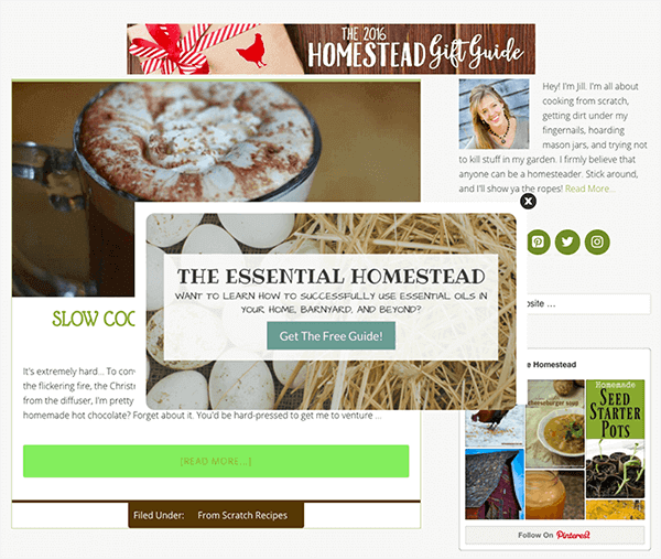
When a visitor first explores The Prairie Homestead blog, for example, they're presented with a pop up after spending a brief amount of time on the page:

Notice how the content in the form relates to what they would read about on the blog. In this case, the ebook becomes a supplement to what they'll find, and allows Jill to grow her email list.
Notification bar form. A notification bar form sits at the top of your site or blog. Pop up forms can be disruptive for some audiences, and static sign up forms can get lost in the content. The notification bar form is a great way to promote your form on the top of a web page and ensure that new visitors are aware of your email list.
Slide-in form. A slide-in form can be less intrusive than a pop up, and is perfect for pages that have a lot of content. As a user scrolls down a page, a simple sign up form will slide onto the screen, usually from the lower right corner. This engagement typically hits the reader after they've already started reading the post and obtained value from your content.
In this example below from our friends at CrazyEgg, notice how the slide-in form in the bottom right corner doesn't interrupt the user experience:

As a result, readers can make it through the post uninterrupted and have an opportunity to sign up for a free trial.
The copy
Your form should tell readers exactly what they're going to get after signing up to your list. Will you be sending them a weekly newsletter? Product promotions? Setting clear expectations will be key to attracting quality subscribers who want to hear from you – and staying out of the spam folder.
Your sign up form should clearly explain the benefits to signing up for your list, including information about content (i.e. blog updates, email newsletters) and how frequently you'll be sending (i.e. daily, weekly, monthly). By defining this up front, your subscribers will know exactly what they signed up for, which increases the chance they'll view your emails as valuable instead of spammy.
The call-to-action
This is the part of your sign up form where you ask readers to take a specific action. In this case, your call-to-action (CTA) is to sign up to your email list. Instead of going with the generic “Sign Up” button, however, try getting creative. A unique, contextual and action-oriented phrase such as “I wanna join!” or “Send me my free ebook” will certainly grab your reader's attention.
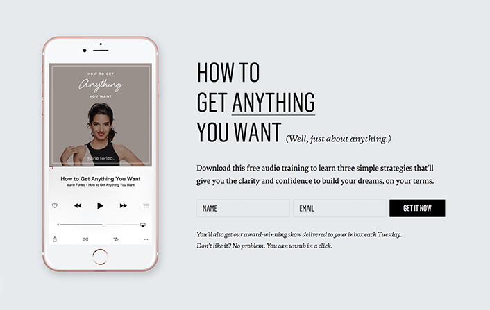
Here's a great example from entrepreneur and author Marie Forleo:

This CTA works so well because it complements the rest of the content within the form. It's actionable, fresh and relates to the incentive that encourages sign ups.
Plus, the copy at the bottom of the form helps set expectations of what people get by subscribing to the list.
The location
Your sign up form should appear on highly trafficked website pages, such as your homepage or blog. Ideally, you want to place it in a location where it's noticeable and grabs your visitor's' attention. Since the location will also depend on the type of form you use, be sure to consider this as you decide on what form is best.
The design
To create a consistent experience, your sign up form design should reflect the look and feel of your website and/or brand.
In addition to carrying over various brand elements, consider the size of your sign up form and colors used within it; for example, you might want to use a more attention-grabbing color for your CTA button.
Create incentives
People love receiving exclusive gifts and discounts. So why not add one to your sign up form? Offering an incentive (or lead magnet) that appeals to your audience is a great way to encourage them to sign up to your email list – especially individuals who are on the fence.
Nobody wants to ‘Join a newsletter’ so stop asking. Give them something in exchange for their information, which is really a currency in the digital age. Make sure they are getting something valuable in that exchange and they’ll love you for it.
- Justin Rondeau, DigitalMarketer
Common lead magnets include product discounts, ebooks or whitepapers, a downloadable checklist or printable and more.
Customer Spotlight
How powerful can an incentive be? Just ask Jill Winger, homesteader and creator of The Prairie Homestead blog. After launching her website to educate others about maintaining a truly self-sufficient lifestyle, Jill admits that she didn't actively try to grow her audience beyond using an RSS feed. But once she got started with email marketing, she struggled to grow her list.
What then enabled her to grow her list to 50,000 and counting? An ebook she wrote about essential oils and offered for free on her sign up form.
List building tips
If you're active on social networking platforms like Facebook and Twitter, you may already have a growing community of people interested in your business. So why not reach out to this audience and encourage them to subscribe to your email list?
By doing so, you can expand your reach, increase the chances that they'll see your content and nurture customer relationships in a way that can be more powerful than if you were to rely on social alone.
Connect with social followers
Fortunately, encouraging your social followers to sign up to your email list can be as simple as sharing a post that teases exclusive content in your emails. Or, consider adding a sign up form to your Facebook business page and sharing a link to a web-hosted version of your sign up form.
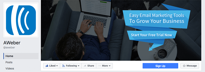
There are also certain social platforms that provide additional opportunities for you to promote your list. Facebook's Call-to-Action feature is one of them:

By linking this button in your cover photo to your email list, you can drive even more email sign ups.
Launch a contest
Host a contest that features a valuable prize and requires an email address to enter. Promote it on social media, your website and any other place where you can interact with your audience.
Publish valuable content
People are more likely to sign up to your email list after you prove that the content you have to offer is worth it.
Once you prove to them that they need your content, they'll be primed for signing up to your list.
To drive more traffic to your website, try tactics like syndicating your content on publishing platforms like Feedly and Alltop. Or leverage strategic partnerships with influencers or other businesses that have similar audiences to yours. The more you can reach new communities of individuals who are likely to be interested in your brand, the more traffic you'll be able to bring to your website – which can increase sign ups to your email list.
Connect with third-party integrations
From landing pages and shopping carts to membership clubs and pop up forms, there are a number of integrations and tools that are designed to help you grow your subscribers. And when you connect them to your email marketing service provider, you can trust that your subscribers will move directly into your list.
Collect subscribers offline
Whether you're at an event or brick-and-mortar store, you're interacting with people who might be interested in your email list. Leverage your interactions with your audience by downloading an email sign up form app to your phone or tablet to collect new email sign ups on the go.
If you'd prefer to go ‘old school,' the reliable pen and paper sign up sheet works just as well. Just remember to add your new subscribers to your email list!
Customer Success Story:
Whenever Emma Johnson, creator of the blog Wealthy Single Mommy, discovers one of her articles is getting a lot of engagement, she leverages it to increase her audience in two ways.
First, she features it at the top of her website so anyone who lands on her blog immediately sees it. Then, she adds a sign up form for her email list at the bottom of the post to capture addresses. The sign up form also features a free downloadable guide to incentivize visitors to subscribe.
With that triple threat, Emma is able to boost her email list.
Take Action! Identify one strategy to start growing your email list and focus on setting that up in the next 10 minutes. An easy first step is creating a sign up form and adding it to your website. You can always create incentives and try another list building tactic another day! (Don't have an email marketing platform? Try AWeber for free today!)


